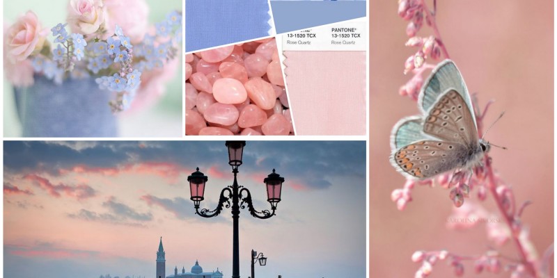
Pantone is an international color language, known as PMS colors, used by designers around the world to access color trends, communicate color choices and control consistency of color across every imaginable surface, texture, material and finish. At the beginning of each year, Pantone releases its much- anticipated forecast to predict color trends for paints, fashion and home, for the coming year. In 2016, for the first time, Pantone introduced two shades, Rose Quartz and Serenity as the PANTONE Color of the Year 2016. According to Pantone executives, “Rose Quartz is a persuasive yet gentle tone that conveys compassion and a sense of composure. Serenity is weightless and airy, like the expanse of the blue sky above us, bringing feelings of respite and relaxation even in turbulent times.”
So, how do you incorporate these trendy colors into your home this year or in following years since the colors Pantone selects typically increase in popularity. Though their tonality is balanced, you may not be able to immediately see these two colors side-by-side for use with a long-term palette. However, pairing these colors individually with grays, browns, whites and even camel creates dramatic timeless looks that will stand the test of time.
Balance Rose Quartz and Serenity with bold color choices, such as sophisticated grays, deep, rich browns or even dark beige. When used in a balanced way, the color will act as an accent, softening the coldness of darker pairs while adding light and warmness to colder, more vibrant, richer colors.
Rose Quartz pairs well with raven, rich cool grays, crisp whites and is a perfect fit with a camel color. Antique bronze, gold and warm nickel also allow the color to truly pop against the metallic finish.
If you plan on using one of these colors, go big or go home. Use the color in a big way, such as the entire room but ground the rest of the room with balance colors to neutralize the influence.
Or, according to decorators, use it as pops, repeating it three times in the room, in various shades to create a layering in of the accent. You never want everything to match, so your base color and then tones of it, layered give you the most timeless and effective use of the featured color.

